Restaurant, hospitality · Live · 2025
Spice Garden
A full restaurant site — menu, gallery, reservations — built to make the food look real and the one action that matters impossible to miss.
Context
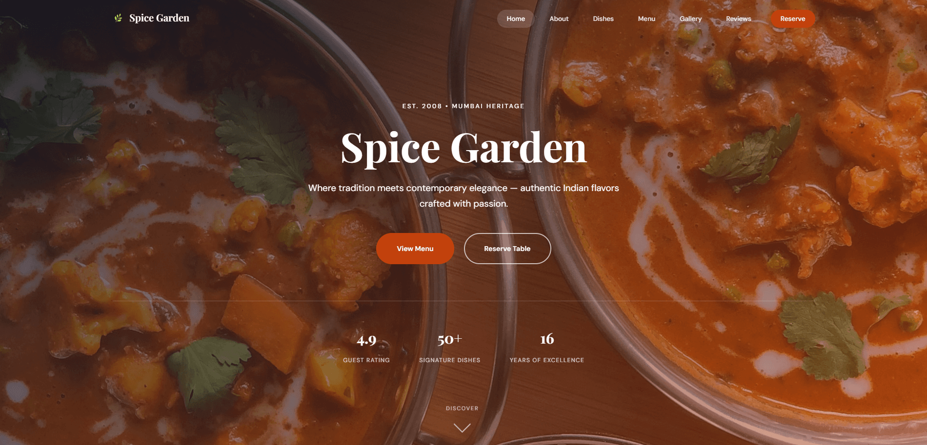
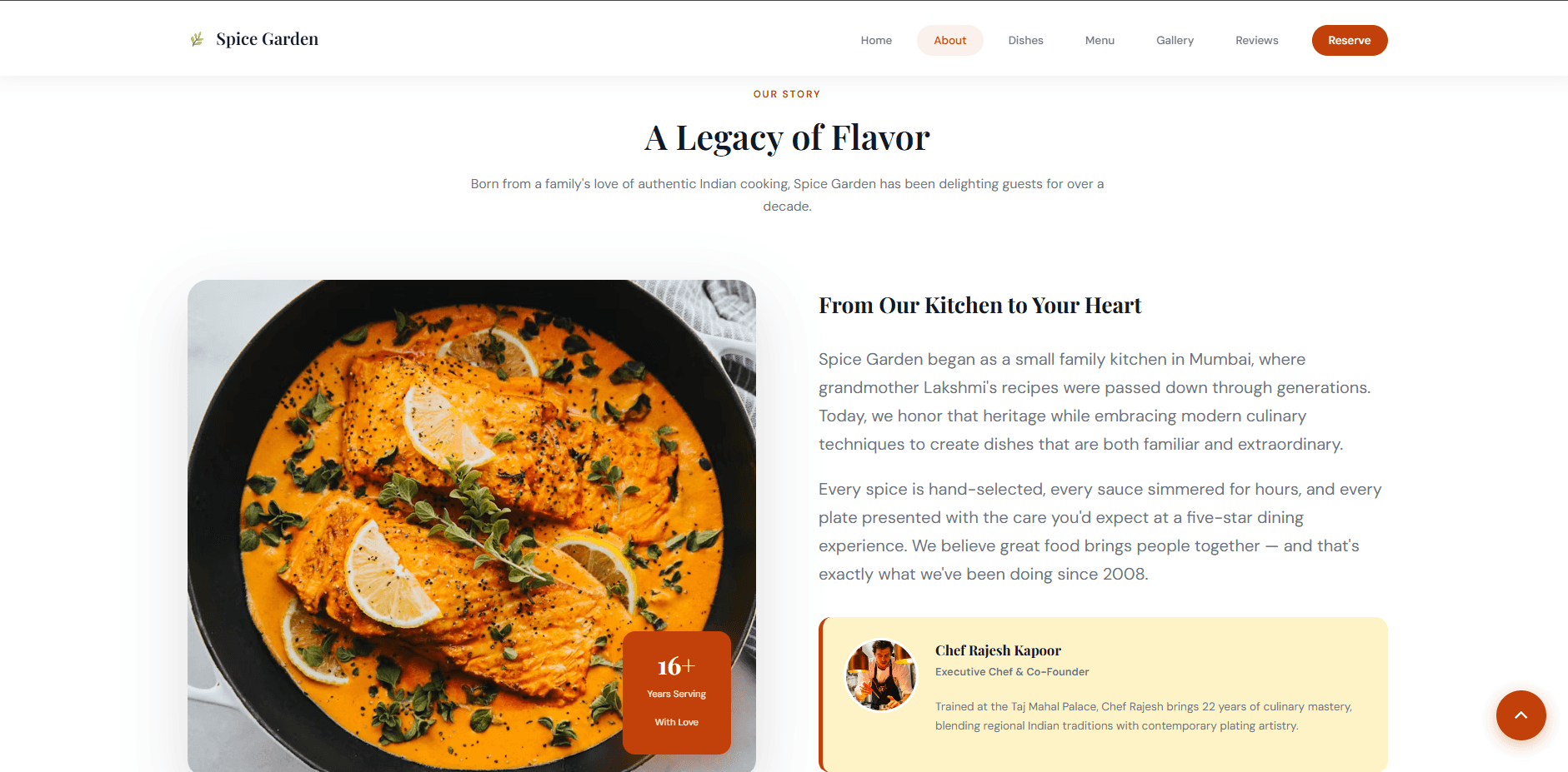
A restaurant site built as a practice client engagement — a family-style Indian restaurant, presented with the heritage and warmth an in-person visit would actually have.
The Problem
Restaurant sites often try to do everything at once — menu, story, gallery, reviews, reservations — with equal weight given to each, which means the one action that actually matters commercially (booking a table) has to compete for attention with a photo gallery.
Research
Looking at how real restaurant sites structure menu information — dietary tags, price clarity, honest dish descriptions — and how reservation forms commonly fail: too many required fields, unclear time-slot availability, no confirmation the guest can trust.
Constraints
Needed to read as premium without a real photography budget — meaning the design had to carry weight through typography, spacing, and color as much as through the food photography itself.
Thinking
Follow the guest's actual decision path — discover the restaurant, browse the menu, decide, book — and let each section of the page serve exactly one step, rather than spreading every kind of content evenly across the whole scroll.
Design Decisions
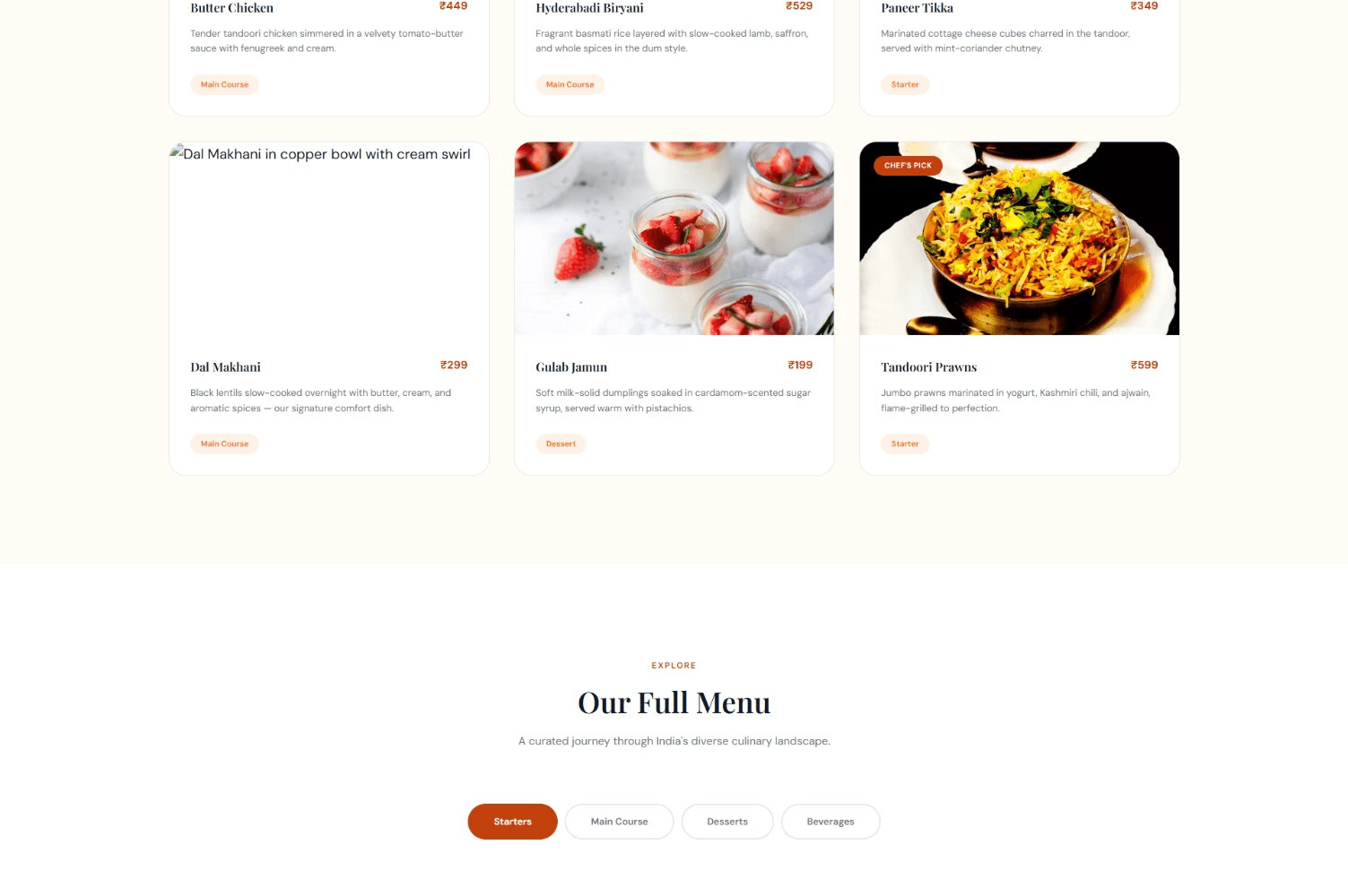
A warm terracotta-and-cream palette against full-bleed hero photography, a featured-dishes grid with honest status tags, and a full menu with category tabs so a visitor can jump straight to what they came for. What got simplified: an initial version had five separate navigation destinations for menu content alone — collapsed into one tabbed component.
Engineering Decisions
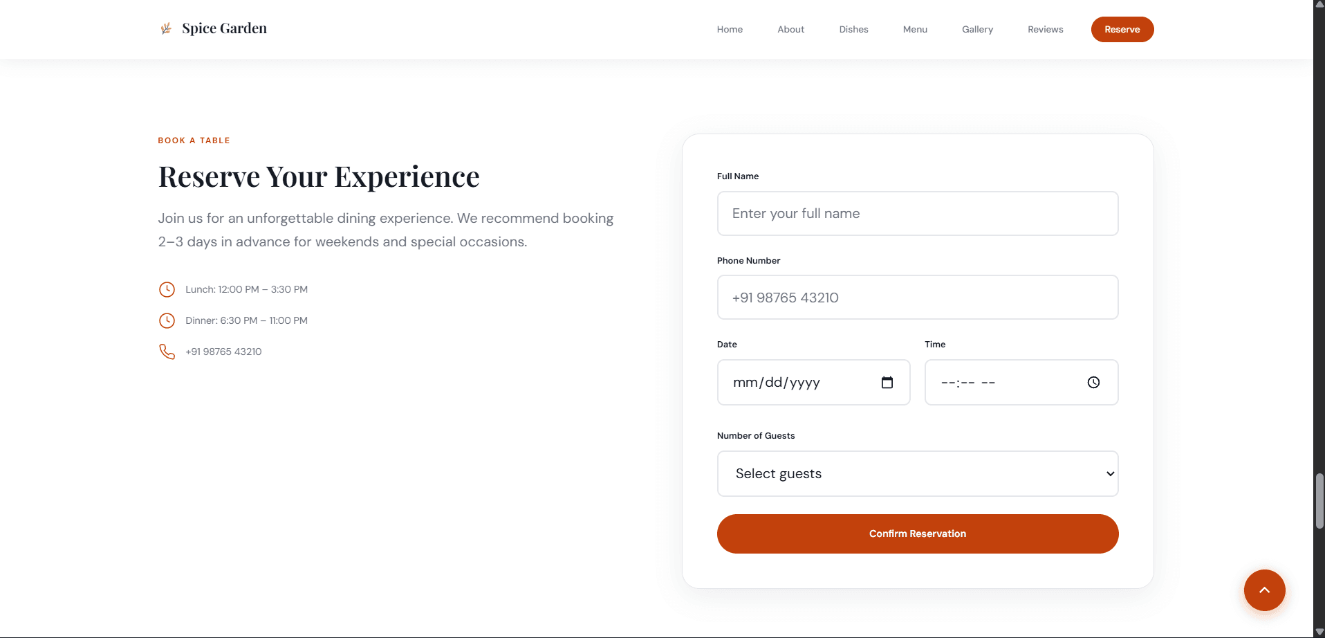
Built in React with CSS Modules for scoped, collision-free styling, plus a reservation form with genuine client-side validation on date, time, and party size rather than a form that silently accepts anything.
Motion Philosophy
Minimal and functional: category-tab switches cross-fade, dish cards lift slightly on hover to read as clickable, and that's the full list — nothing animates just to fill a portfolio reel.
Failures Encountered
An early gallery layout used a lightbox that blocked scrolling on mobile without an obvious close affordance. Replaced with a simple in-flow grid — less dramatic, considerably less likely to trap someone on a phone.
Trade-offs Made
Chose a tabbed single full-menu view over separate pages per category — fewer page loads, and a visitor can compare a starter against a main course without losing their place.
Result
A complete, working reservation flow, a browsable menu with category filtering, and a gallery — the core commercial path from "looks good" to "table booked" fully functional end to end.
Lessons Learned
That a gallery and a testimonials section are the easiest parts of a site to get visually right and the easiest to under-invest in structurally — worth planning their data model before their visual design, not after.
“The next version of this project would spend more of its planning time on the guest-review data itself — where reviews come from, how they're moderated — before touching the visual layout for displaying them.”
Next Case Study
Elevate Digital