Marketing agency · Live · 2025
Elevate Digital
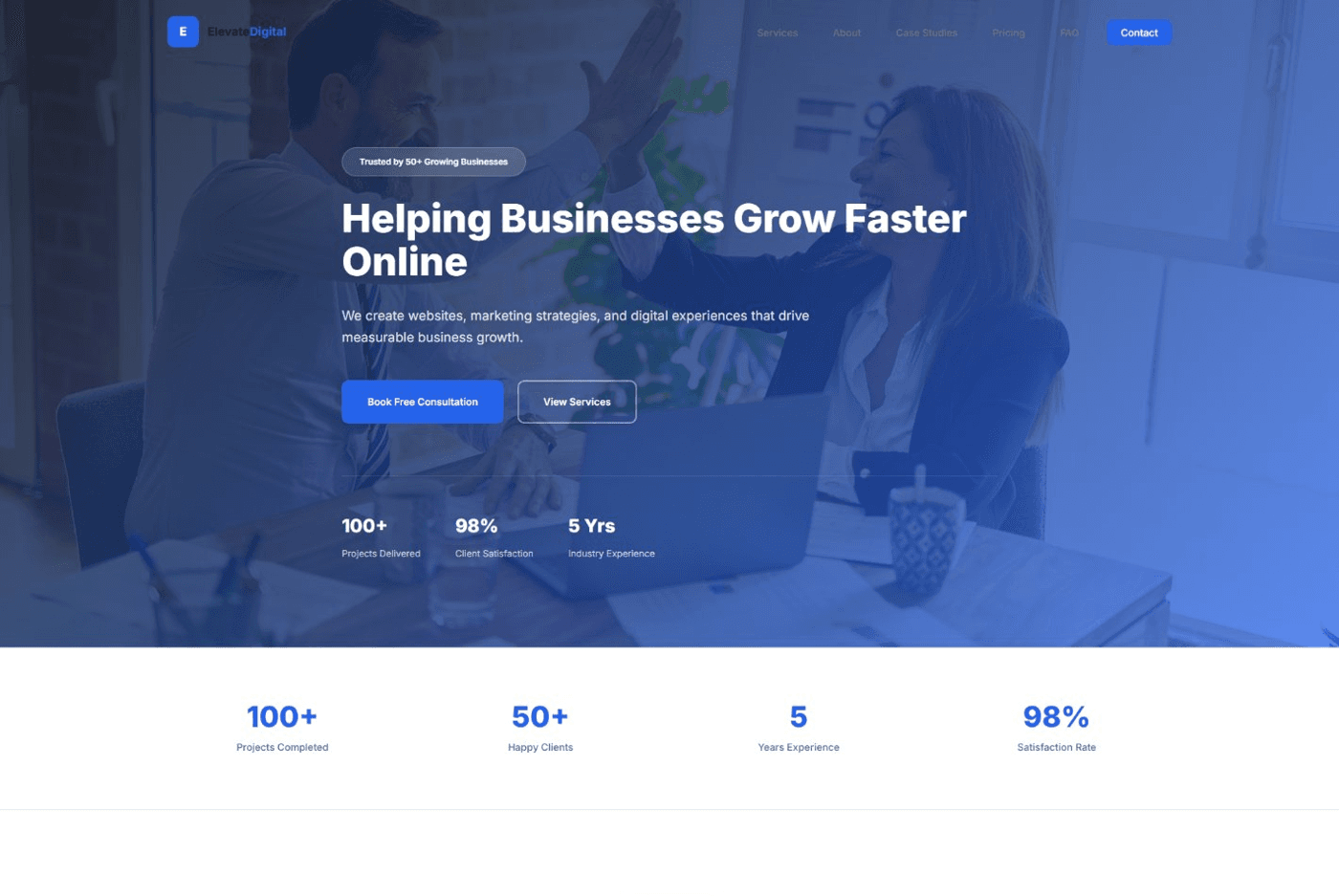
A complete marketing-agency site — services, case studies, transparent pricing, FAQ — sequenced to earn a consultation booking.
Context
A digital-marketing agency site built as a practice engagement — the most content-dense of the three real projects, and the clearest test of keeping a long page still feel organized rather than exhausting.
The Problem
A visitor arriving at an agency site is being asked to trust a stranger with real money. Every section — services, proof, price — has to do real persuading work before the contact form, or the visitor simply leaves.
Research
Looking at how agency sites typically sequence trust signals: stats up top, a service breakdown, proof in the form of case studies, and only then price — price anxiety gets addressed after credibility, not before it.
Constraints
Needed to hold together as one coherent page despite covering an unusually wide range of content types — stats, services, differentiators, case studies, testimonials, pricing, and FAQ — without any one section feeling bolted on.
Thinking
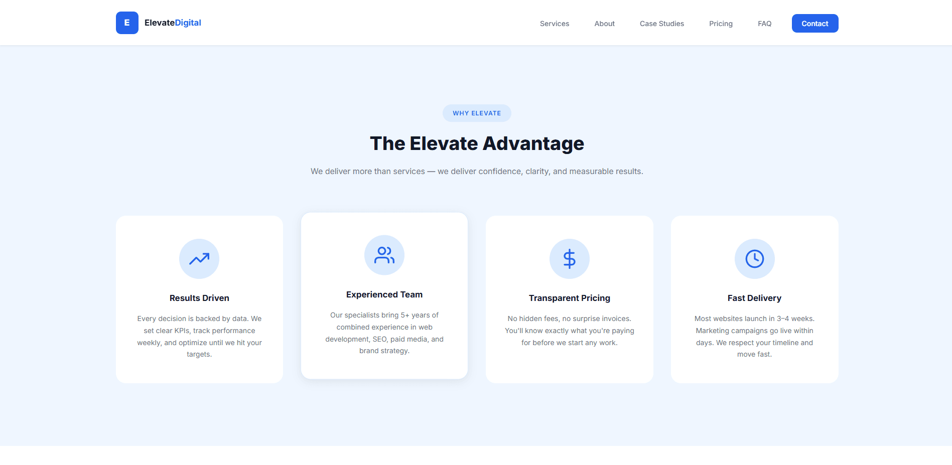
Build the page as a deliberate sequence, not a checklist: hero stats, services, differentiators, case studies, testimonials, pricing, FAQ, contact — each section earning the visitor's attention for the next one, not just occupying its own scroll position.
Design Decisions
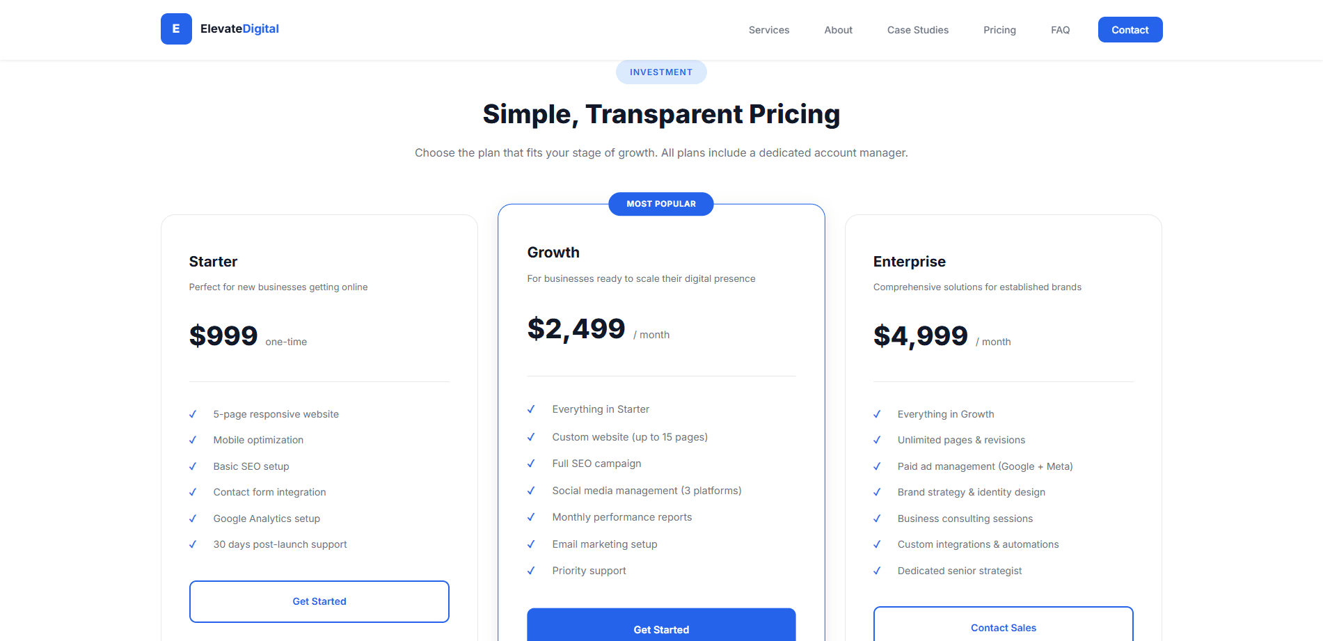
A confident blue palette with alternating white and light-blue panel sections for rhythm across a long page, and a three-tier pricing table with a clearly marked "Most Popular" option, so a hesitant visitor has a recommended default rather than three equal, undifferentiated choices.
Engineering Decisions
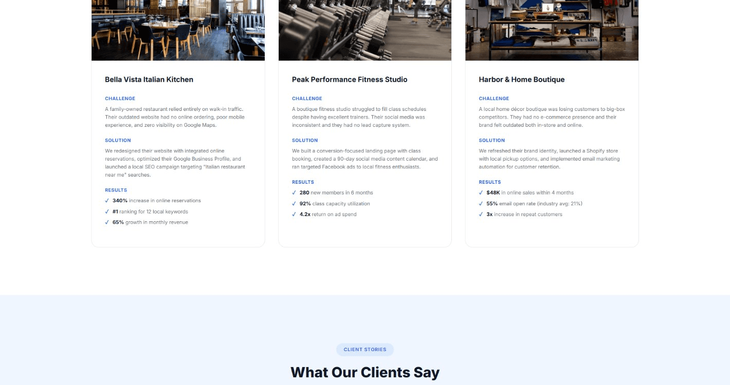
Built in React with Tailwind CSS; the FAQ section uses a proper accordion component, and the case-studies section reuses one shared card layout across all three example client stories rather than three hand-built variants.
Motion Philosophy
Section entrances use a single consistent fade-and-rise; the FAQ accordion expands and collapses smoothly; the pricing table's recommended tier is marked by a static badge, not an animated flourish — restraint, deliberately, on the page that could most easily have overdone it.
Failures Encountered
An early draft of the case-studies section used real-sounding but invented statistics for the example clients. On review, that read as exactly the kind of fabricated proof this whole practice is built to avoid — the copy was rewritten to frame those examples honestly as illustrative, not verified outcomes.
Trade-offs Made
Chose three pricing tiers over a single custom-quote-only model — a visitor gets an immediate sense of scale and cost before ever having to start a conversation, at the cost of a slightly less tailored first impression.
Result
A complete, working marketing site — services, proof, transparent pricing, and FAQ in one clear sequence, with a validated contact form as the final, working step of that sequence.
Lessons Learned
That a long page's biggest risk isn't length — it's inconsistency. One shared card language across every proof section is what kept a content-dense page from feeling assembled rather than designed.
“Worth being explicit about: the example client case studies and figures on this demo site are illustrative content for the template, not verified business outcomes — a distinction worth stating plainly, consistent with this whole practice's own honesty standard.”
Next Case Study
Personal Portfolio