Personal practice · Live · 2025
Personal Portfolio
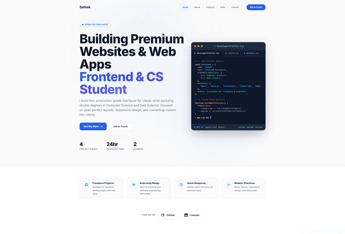
A developer portfolio built to prove a claim rather than state it — real projects, real stack, real response time.
Context
A portfolio has an unusual problem: it has to convince a visitor of the same craft it's demonstrating, at the same time. There's no separating the message from the medium.
The Problem
Most portfolios at this stage either undersell real, working ability or oversell with vague adjectives — "passionate," "expert," "innovative" — precisely because they don't yet have much specific and verifiable to point to instead.
Research
Looking across developer portfolios and freelance marketplaces, one pattern held consistently: a live demo link did more convincing than any paragraph of description, and a specific number — a response time, a project count — read as more credible than an adjective ever could.
Constraints
Had to be buildable and maintainable by one person, alongside a full course load — which ruled out anything requiring a second person's ongoing involvement, a separate CMS to administer, or infrastructure that would need babysitting.
Thinking
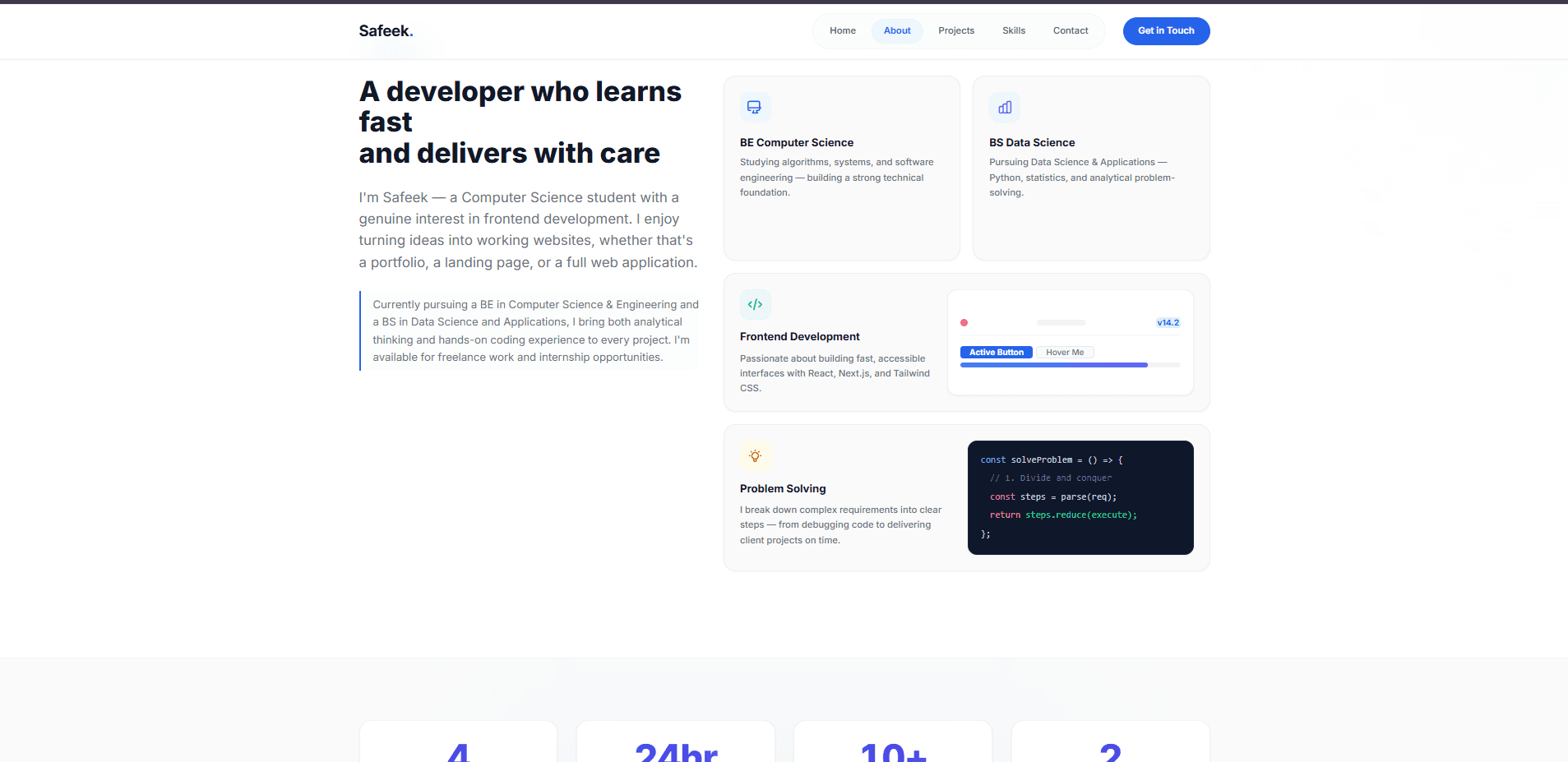
Start from the actual content, not the layout. Write the real stats, the real bio, the real project descriptions first — then design a structure that gives each one room to be read clearly, rather than fitting real information into a template built for placeholder text.
Design Decisions
A clean, restrained visual language with one distinguishing device: a live code-editor mockup in the hero, showing an actual TypeScript object rather than a stock photograph of someone typing. What was left out: testimonial cards with no real testimonials in them, and a skills section with invented proficiency percentages.
Engineering Decisions
Built on Next.js's App Router with Tailwind CSS for styling and Framer Motion for the hero's load-in and the scroll-triggered reveals — a stack chosen for being genuinely comfortable to maintain solo, not for being impressive to name-drop.
Motion Philosophy
Motion is used exactly where it confirms something is real: a blinking cursor in the code mockup (the one piece of continuous animation on the page), and a hover state on the one proof-card that's supposed to be interactive. Nothing animates purely for entrance's sake.
Failures Encountered
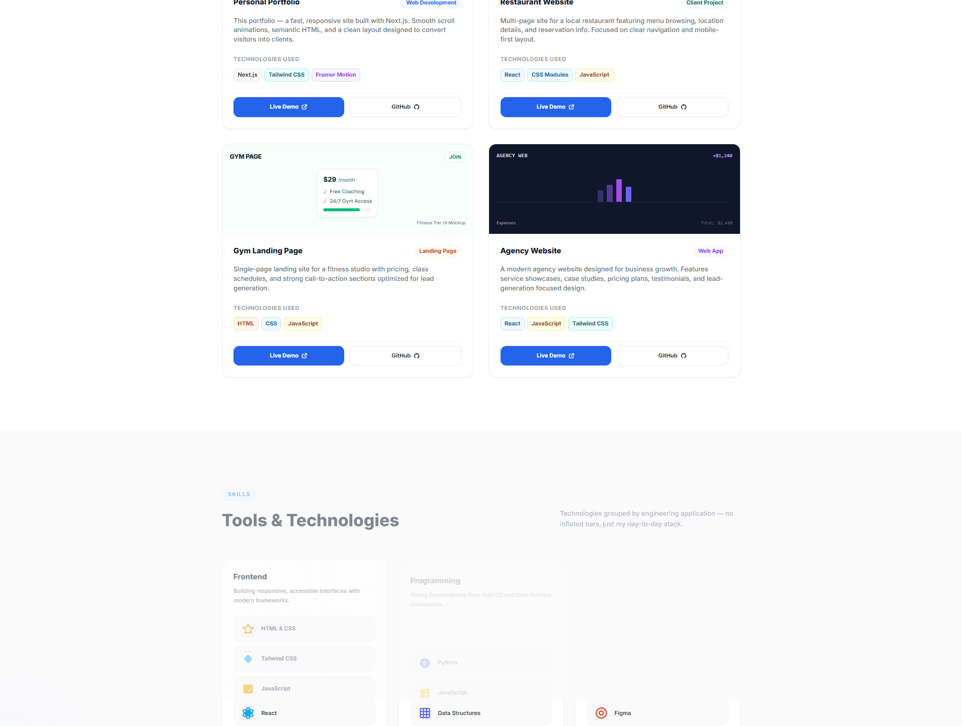
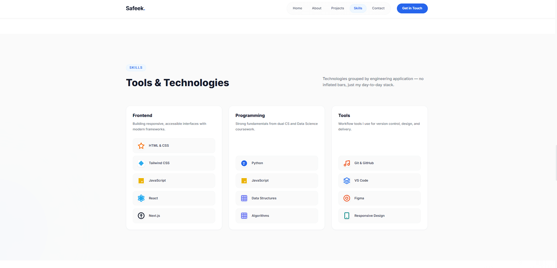
An early draft included a skills section with progress-bar-style proficiency indicators. It looked more impressive and was less honest — a bar implying "73% at React" measures nothing real. It was replaced with a plain grouped list.
Trade-offs Made
Chose to show fewer projects, well-documented, over a longer list of thinner entries — a smaller portfolio that can be verified beats a longer one that can't.
Result
A live, working site that this very case study is an example of — the most direct proof available that the pixel-level care claimed in the hero holds up under its own scrutiny.
Lessons Learned
That restraint is itself a credibility signal: leaving out a testimonials section with no real testimonials said more than filling it with placeholder quotes would have.
“The next version of this practice is what's being built right now — dedicated pages, real case studies, a contact flow that isn't just a form. Building v1 honestly is what made it possible to specify v2 accurately.”
Next Case Study
Spice Garden